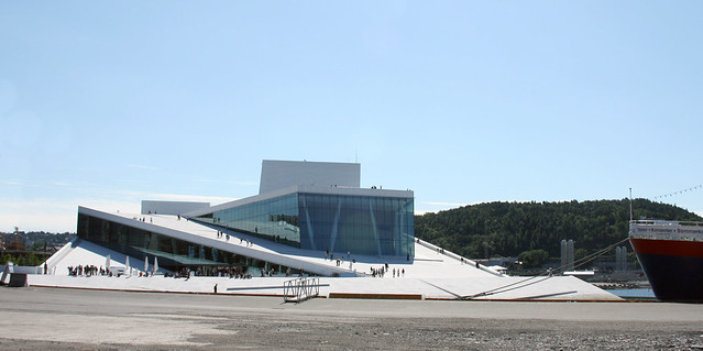
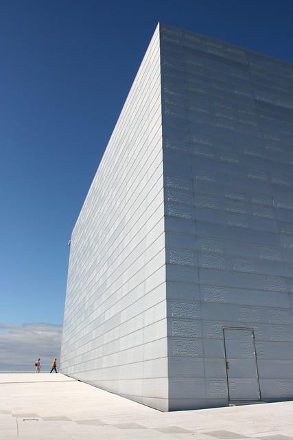
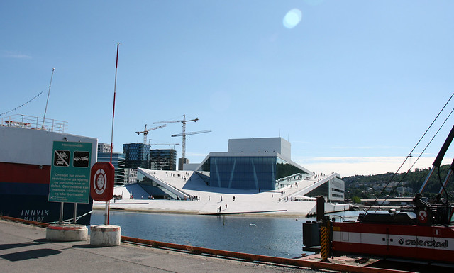
I didn’t know what to expect, but I suppose I was thinking along the lines of the Sydney Opera House with its iconic silhouette. Thus I was surprised to see the understated presence of the Oslo Opera House, rising from the waters of the Oslofjord, blending with its environment rather than striking a new profile.
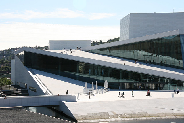
As we approached, my sister remarked, “Are there people walking on the roof?”
Indeed they were. The architects at Snøhetta created a seamless transition between the ground level and the rooftop. I quickened my pace, wanting to claim that I effortlessly scaled the building to the roof like Spiderman.
The white Carrara marble’s rough texture provided enough friction to comfortably climb the incline.
I imagined that if this building was built in California, the building codes would have forced unsightly railings in all places where there might be a remote chance that someone may get hurt. Here in Oslo, a mere small sign gave a cautionary warning.
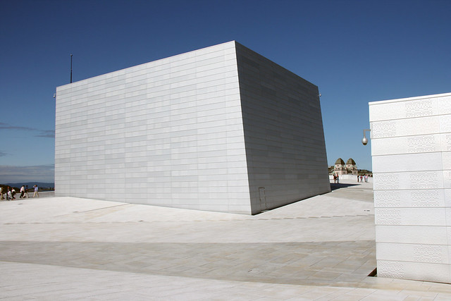
At the top I was faced with a stark white synthetic snowscape glistening in the sun.
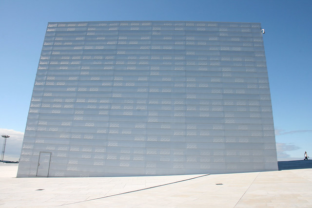
The aluminum-clad building looked like a cubic igloo...
... of grand proportion.
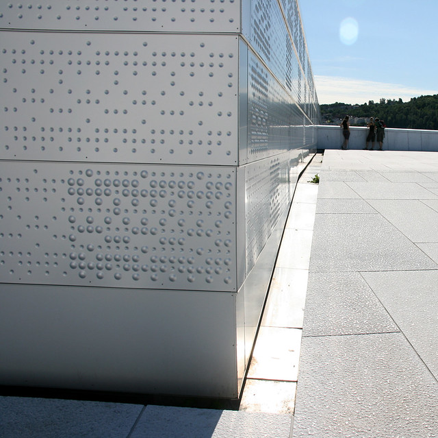
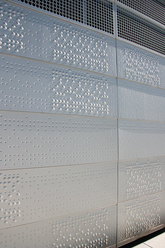
A closer look revealed that the aluminum is punched with a pleasing pattern of concave conical dimples and convex hemispherical blisters...
... each contributing to a texture of shadows.
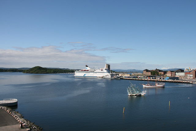
Turning the corner, I took in the view of the Oslofjord where a giant cruise ship towered over the waterfront...
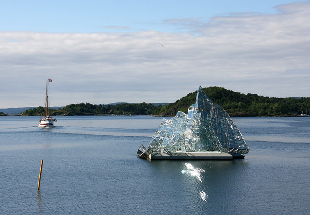
...and a stately double-masted schooner motored out, proudly waving its Norwegian banner:
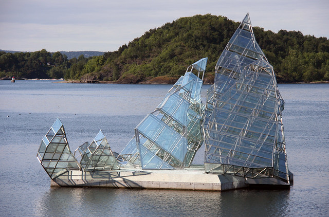
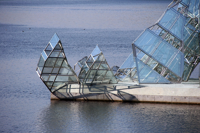
Monica Bonvicini’s glass sculpture “She Lies” floated at the head of the fjord...
...and pivoted on her axis to show her many angles:
 |
| “Das Eismeer” (1823-1824) by Caspar David Friedrich |
At first glance, I thought the sculpture looked like a schooner with her sails unfurled. I later learned that Venice-born Bonvicini won the international competition by using a famous German Romantic Landscape painting “Das Eismeer” (1823-1824) by Caspar David Friedrich as inspiration.
This ambitious installation is strong enough to withstand the harsh elements of the Norwegian winters.
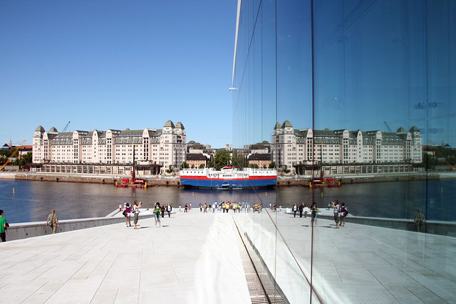
As I descended back to the ground level, I enjoyed seeing the reflection of the traditional silhouettes on the waterfront onto the ultra-modern sleek glass surface of the Opera House.
The Oslo Opera House is meant to be the anchor to spur on urban revitalization. While it's well on its way...
...I hope to come back one day to see the vision set forth by the architects at Snøhetta come to fruition.
 |
| Copyright: Snøhetta for Statsbygg. |
See other Macro Monday posts at Lisa's Chaos.
Update: To see some great interior shots of the Operahuset, go to Ginnie's blog post here.


